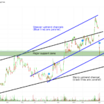
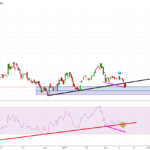
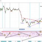
As I stated in yesterday’s “Charts of the Day”, both Novo and Irving looked fragile in the short term. Well, within 24 hours both had corrected a lot. All the way down to levels which I thought were too good pass on, thus I started...
Continue reading » April 2, 2019 admin Chart of the Day, Gold & Silver Stocks, Horseman's Portfolio No Comment A quick look at some charts for companies that I own to a large or small degree: Kirkland Lake (KL.TO) Log chart: … We can see that it bounced but then proceeded to break the black support line, which of course was a...
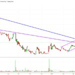
Continue reading » April 1, 2019 admin Chart of the Day, Gold & Silver Stocks, Horseman's Portfolio No Comment It’s getting tight… … Looks overall bullish to me.
Continue reading » March 26, 2019 admin Chart of the Day 1 Comment I suppose the miners won’t see fireworks (big inflows) until the dotted line is broken:
Continue reading » February 9, 2019 admin Chart of the Day, Gold & Silver Stocks No Comment Look at these four long term charts and see if an interesting picture starts to materialize… Long Term UST 2s4s Spread: Long term Commodities versus US Equities (S&P 500) Ratio : Long Term Gold/SPY (S&P500) Ratio: Long Term...
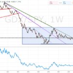
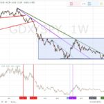
Continue reading » December 4, 2018 admin Chart of the Day, Gold No Comment The GDX/SPY ratio is again butting head with a long resistance line that has held many times (so far). A rising ratio means that GDX ETF (Major miners) are outperforming the SPY ETF (S&P index). Are we nearing a big break that will signal the...
Continue reading » December 4, 2018 admin Chart of the Day No Comment The US dollar still rules the day, which opens up for a correction in gold if we get that bounce in the dollar. Negative correlation to VIX is still somewhat high. Overall, most of the correlations that have at some points been pretty strong...
Continue reading » February 20, 2018 admin Chart of the Day, Gold No Comment Dollar has ruled the day for quite some time. GDX has had a stronger correlation with Exxon Mobil (substitute for oil expectations) and VWO (Emerging markets) than TIP (real yields) and GVI (bonds). VIX correlation turned to below -0.25 before the VIX spike… Maybe...
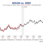
Continue reading » February 7, 2018 admin Chart of the Day No Comment Current gold price versus the 2001-2003 gold bull (scary similar): Gold/Silver Ratio and silver:
Continue reading » February 5, 2018 admin Chart of the Day No Comment Just to get a sense of what the situation is for the commodity market overall in the medium to long term I put together a few charts that can be seen below. These all suggest to me that we indeed are in a raging commodity...
Continue reading » January 19, 2018 admin Chart of the Day No Comment 