


Correlation Table: Added USD/Indian Rupee
I decided to add the currency of the worlds biggest or at least second biggest gold consumer, and the biggest silver consumer to my correlation table, namely the Indian Rupee (INR). One would think that the strength of India’s currency, ergo the international purchasing power of the indian gold and silver consumer, should at least play a role as to where prices are moving even in US dollar terms. The Rupee showed a decent correlation with GLD, but especially the gold miner indices GDX and GDXJ…
- Correlation table for 2010.01.01 – 2017-04-04 based on Daily Adjusted Close from Yahoo Finance:
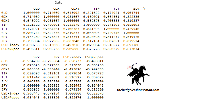
Correlation table.
Note that the negative correlation for USD/Rupee and GLD, SLV, GDX and GDXJ means that when the Rupee strengthens versus the US dollar, the metals and miners also seem to show a positive performance. It is also interesting to see the Rupee being a decent amount more correlated with silver than gold, a stronger correlation jump compared to the Japanese Yen.
- Given that I am heavily invested in the sector I thought it would be interesting to create a graph showing GLD vs USD/INR, to see if the Rupee could be of any help in regards of spotting trends in the precious metal space:
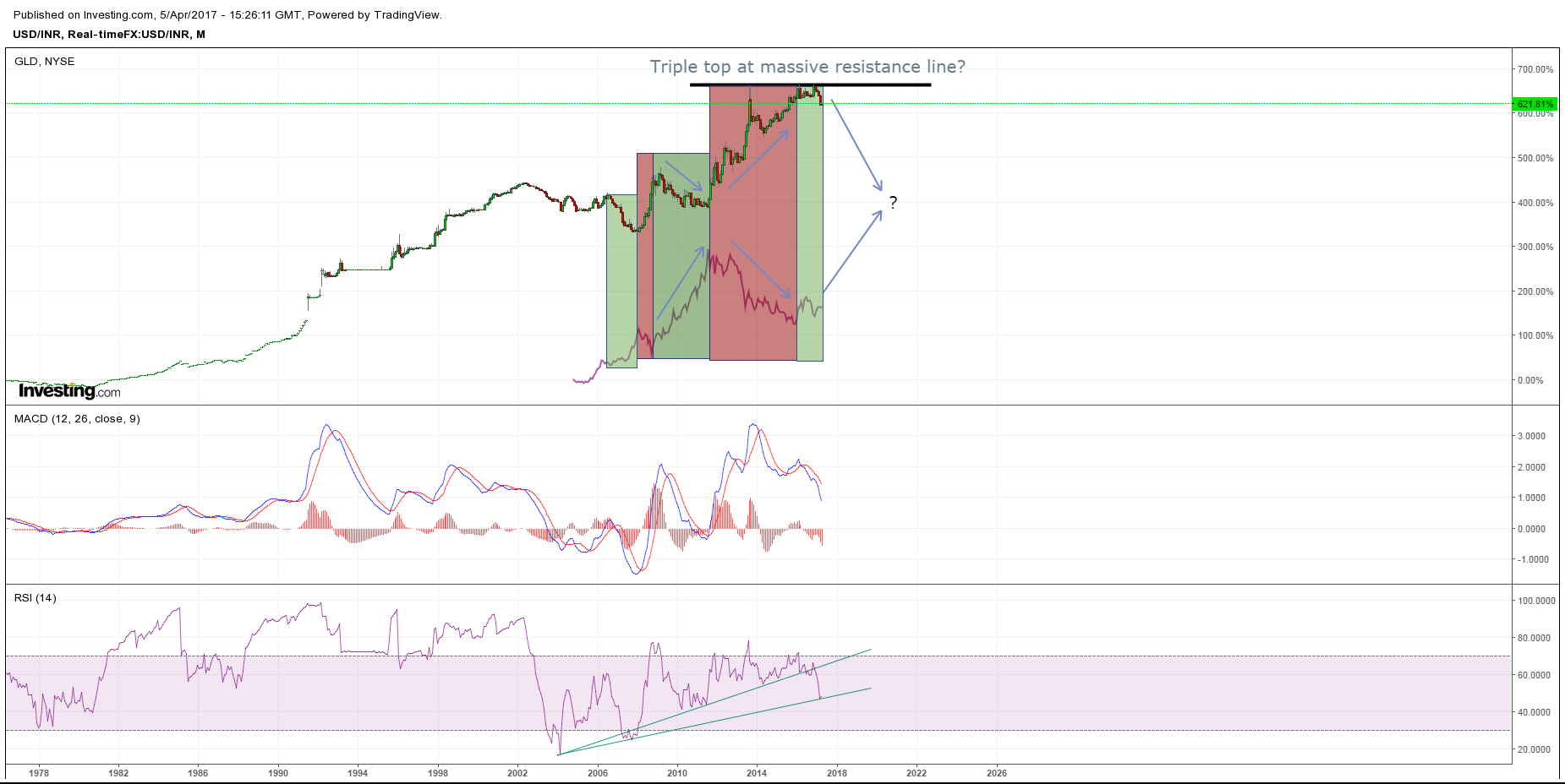
USD/INR vs GLD (Monthly).
The graph above backs up the data in the correlation table pretty nicely, in that USD/INR multi month trends seem to move in the opposite way of GLD during the same time period. The green rectangles shows periods when the Rupee is weakening and GLD strengthening. The red rectangles show the opposite action in both assets. If the Rupee indeed has bottomed after forming a triple top in USD/INR, then going by recent history, we should be in the beginning stages of a full blown bull market in gold.
- Since the Rupee showed an even bigger correlation with SLV than GLD starting from 2010 I also graphed USD/INR vs SLV:

USD/INR vs SLV (Weekly).
Since the volatility in silver is much larger than gold, and especially a currency, it’s harder to compare it with the Rupee in a graph. However, one can still make out that silver (like gold), seems to trade with the Rupee, ergo counter to the USD/INR exchange rate trend.
Conclusion
Given the correlation data and the graphs it seems prudent to watch the development of the currency attributed to largest or second largest consumer of gold and the single biggest consumer of silver. It’s also interesting to see that although USD/JPY showed stronger correlation with the metals and miners (probably because HFT trading/manipulation), the USD/INR seems to have a larger correlation percentage jump from gold to silver than the Yen. This may be because India is the largest player in the actual PHYSICAL silver market.
Also the fact that USD/INR shows very strong correlation with the mining indices I take it as a BIG bullish sign that the Rupee may indeed have put in a huge triple bottom versus the US dollar (USD/INR triple top).