


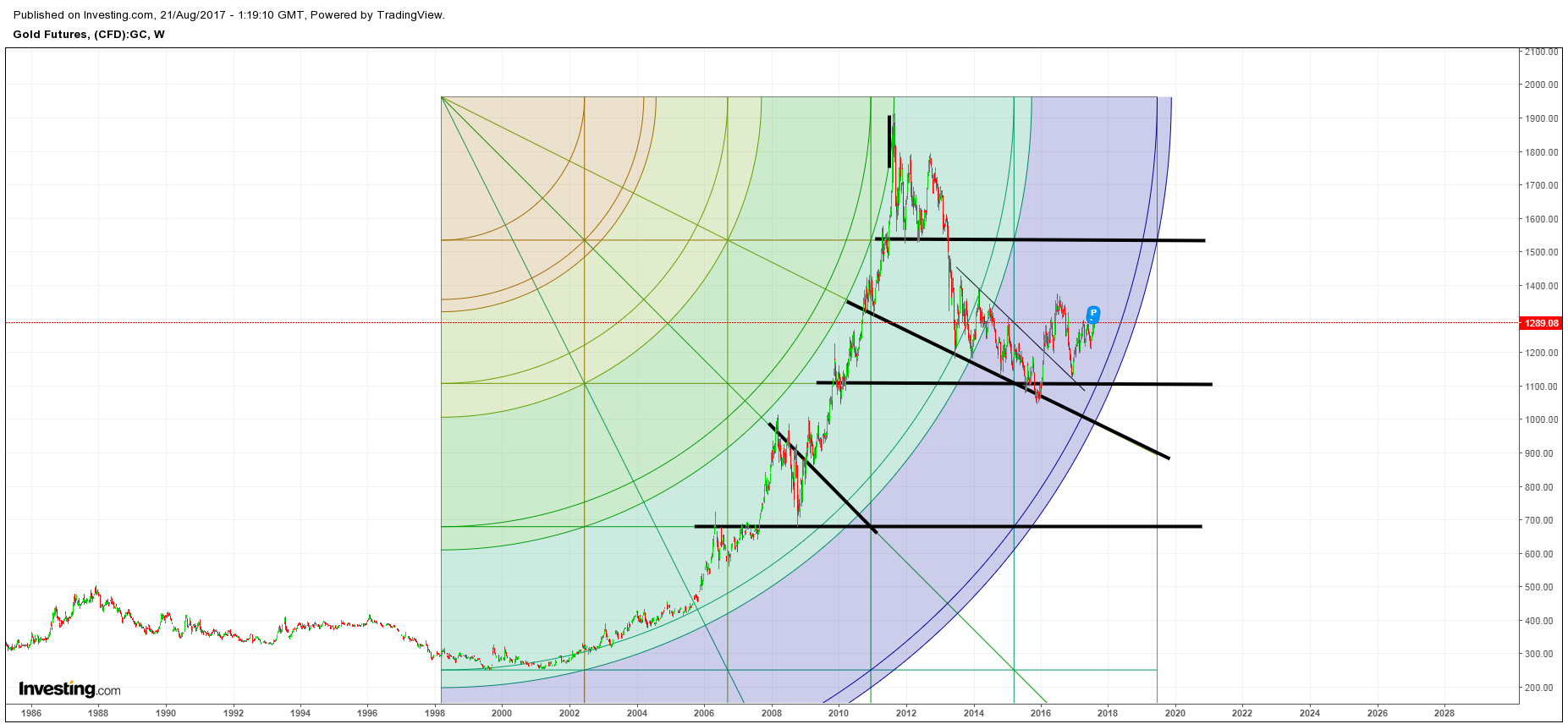
Charts of the Day: Some Interesting Patterns in Gold and Silver
Took a few hours last night to have some fun with some charting tools I rarely use, and this is what I came up with (some obviously fits better than others):
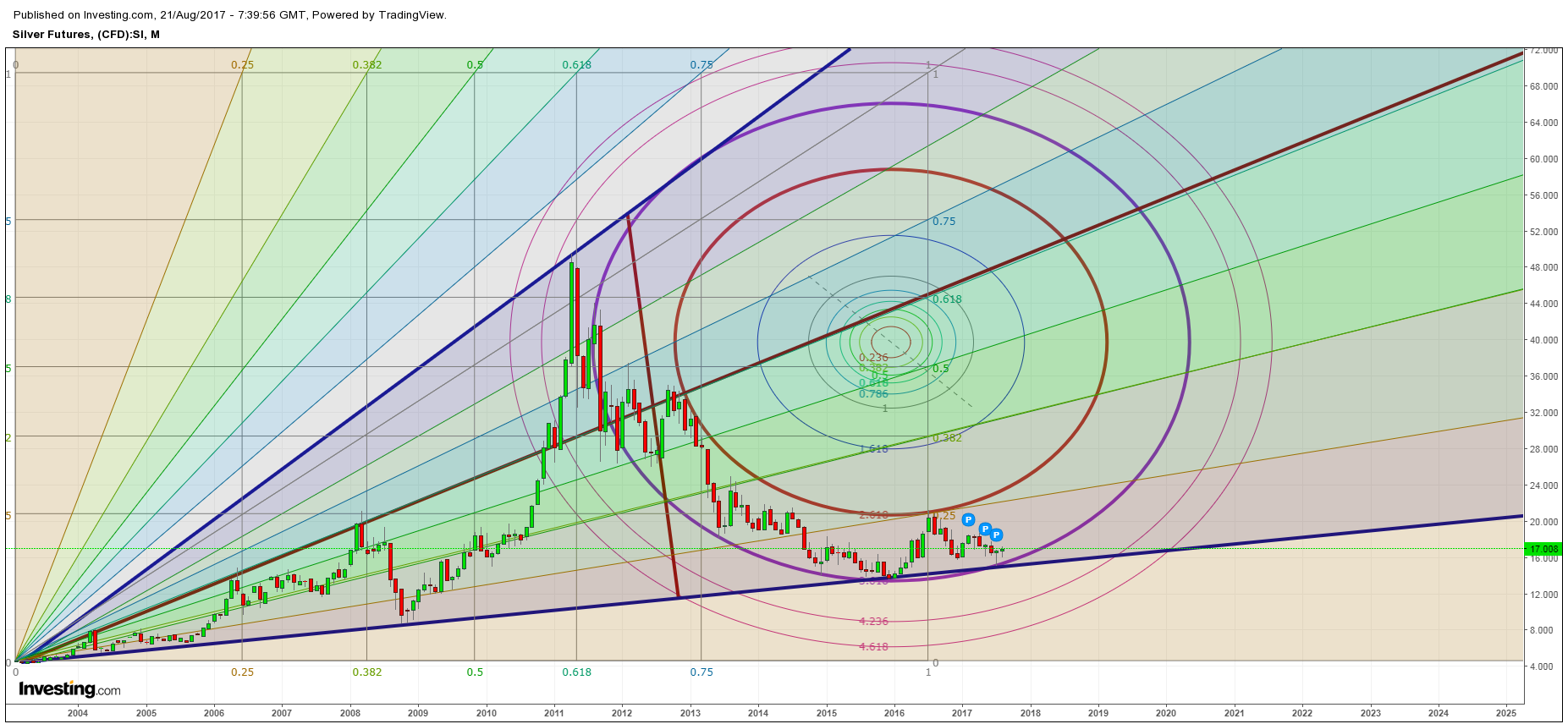
Silver
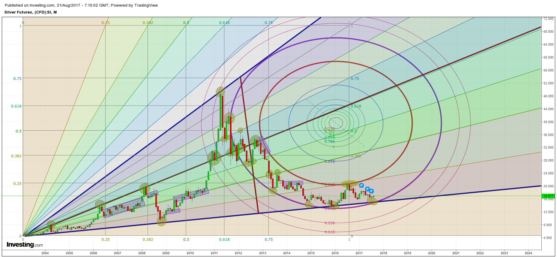
Silver1
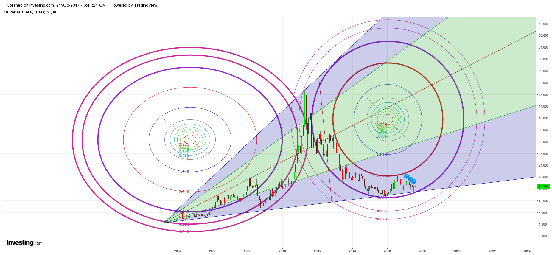
Silver2
Silver3
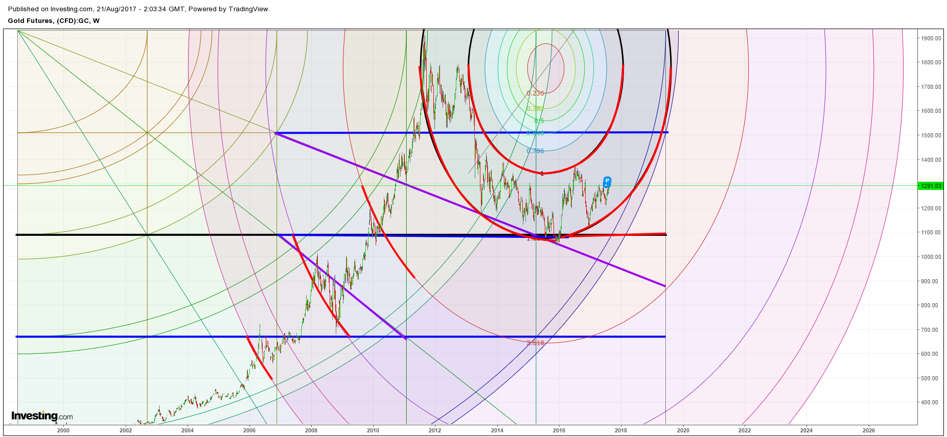
Gold
Gold1
Gold3
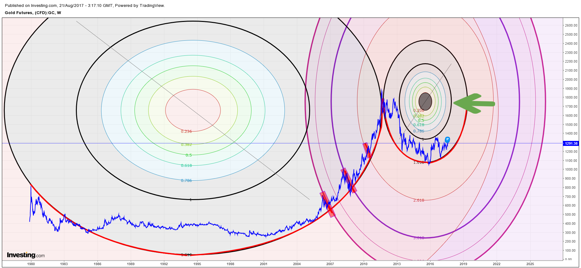
… I did it just for fun, but it was interesting that some of these geometric tools seem to fit pretty well (better than I would have thought) with the price action in both gold and silver. If those circle supports prove to be real, it suggests that we should indeed see a pretty nice exponential ramp in prices during the next two years.